Tuesday, October 28, 2014

Mise en place- cookin' up a stack of shades

I love all things food just about as much as I love all things fabric.  Long ago I had the opportunity to work as a prep cook in an upscale restaurant, where I learned about "mise en place"- which means "put in place", referring to the chef's set-up of ingredients and tools needed for the night's work.  Everything is in the exact same place, every night, so the chef can easily pick up whatever is needed with the least extraneous movement.

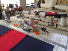
Now I use that concept with the workroom's sewing projects.  Here is my shade-making mise en place- this is NOT just some random scattering of tools and supplies- it's all carefully arranged for maximum efficiency.

At the top of the table I position everything I need.  I have actually four- no, five- pairs of utility scissors out: one at each corner of the shade, plus one good pair for fabric. 
In the center are items that I'll need to be able to reach from both sides of the shade.  Towards the back is a rack with ladder tape and lift cord.  Behind it is a lint roller, and transparent rulers.  There are straightedges everywhere, of every length.
On the shelves under the window are things I might need- extra ladder tapes, mesh cord shrouds, and lift cord in all the colors they make, all the various types of adhesive tapes, weight bar pocket tubing in two colors.
In the center of the table I keep a box of rings; a box with needles and thread in the colors I'll be using; a box with purple disappearing pens, pencils, a Sharpie, little snippy scissors, and some adhesive remover.  If I'm using a fusible for the side hems instead of sewing them, the fusible is there in the middle.  I keep a fabric stapler for use at the top of the shade; a tag gun as my "guilty pleasure" to tack the weight bar pocket where it can't be seen; I don't often need pins but there they are; and a roll of Rowley's weight bar pocket.  There's the weight bar I'll be using, already cut and waiting.
All the linings for the next batch of projects have been rough-cut and are off to the side, or hanging over the fabric rack, labelled. 
After the shade is laid out, tabled, lining(s) in place, side hems secured,  and ladder tapes run, I move things around a bit.
The rings move into the middle of the shade, with the threads, my favorite needle, and at least two pairs of scissors.  The weight bar is waiting at the bottom of the table, with the tag gun, ready for its turn in the production process.  The stapler sits on the top of the shade so I won't forget to secure all the ladder tapes.  The phone is always in the middle of the table so I can reach it from either side.

With a workload of about three dozen shades to get through, here is my other table, with another mise en place: stacked with lumber that's been cut and ripped and notched to size; brass weight bars cut and marked; and all the Rollease clutches ready and waiting.

There's another mise en place for stapling and stringing- as soon as that process starts for this batch of shades, I'll photograph that too.
Time to start cooking up some shades!


Thursday, October 23, 2014

What we did for the past two weeks.....

It is so much fun to watch an empty house being transformed into a home.  With her distinctive style, Denise Wenacur applies color and texture to a room's elements, creating a cohesive whole, like a painting.
Although not fully furnished yet, our recent window treatment installations have set this renovated house well on its way to looking like a home.
Living Room Before
In the living room, blending textures and tones, a smooth grey roman shade is flanked by slubby linen grommeted panels on brushed nickel poles.


These panels were two full widths per side.  Eight #12 grommets were used per width on 1" poles, and the each panel stacks down to about a foot wide.
On an adjacent wall, we used single width panels on a window half this size with no room for stackback.
 
Thanks to various webinars from CHF Academy, Rowley Company, and other sources, I think maybe I've finally gotten my grommet knowledge internalized.
The most important tip I that I learned that I can pass on is: make a template out of buckram.  Actually cut the holes and thread them onto a pole.  That's how you can be really sure that you're planning correctly and that the seam isn't going to come out facing forward.  The other most important piece of information is that you always must have an even number of grommets.


In the dining room, the embroidered floral kick pleat valance with side panels warms up the space, while the gold textured solid relaxed shade offers privacy.
Viewed here from the second floor landing, the family room is warm and inviting, with new furniture, shades, and cornices. 

Here's the family room before.


To maximize the potential light in the sunroom, the homeowners keep the shades up as high as possible.  But for viewing TV, the shades are lowered, and the double-sided blackout lining method eliminates the pesky "pinholes of light" that we workrooms dread.
From outside, the lining folds up neatly.  All of these downstairs windows had a generous 3" of mounting space inside, which made it feasible to do the double-sided shades.  It also gave enough room to use the larger Rollease clutch which operates SO smoothly. 
The kitchen sink window is dressed with a kick pleat valance out of the same textured gold as in the dining room.
The large master bedroom window is quite tall at 110".  The homeowners need light control.  A blackout shade would have been unmanageably massive and heavy, so  Denise offered blackout draperies with a light-diffusing sheer behind, on a double track with glides, operated with sturdy 5' metal batons in a matching finish.


The smaller window on the adjacent wall had too little room for draperies, so Denise chose a flat Roman shade.  We made this with our latest new method for eliminating pinholes of light, which involves two layers of blackout lining.  More on that another time.
Not photographed: a small shade for the back door, another for an upstairs bathroom, and sheer stretch panels for the front hall sidelights.
A big thank you to my fantastic installer Mario Fuentes...........
And that's what we've been doing for the past two weeks!


Tuesday, October 14, 2014

Two Pinch Pleat projects

Well, the premise of this blog is that our projects are shown mostly in the workroom, warts and all, but, I do sometimes wish I had "after" photos!  I go along on some installations, but often the products are picked up and I never see them in the homes they were designed for, and never get good photos in situ.
Here are two such projects.

Eventually I will get to the house to photograph this one.  Meanwhile, here are a few shots to show how this treatment was assembled.
These pinch pleats were fabricated from an amazing linen with a beautiful drape, at three times fullness; the lead edges are trimmed in a gorgeous woven banding.
While we've mounted plenty of inverted pleat panels to waterfall over a flat topper, this is the first time we've mounted pinch pleats over a topper.  We fitted the topper with screw eyes so the panels could hang with drapery hooks at the pleats, and added velcro so the header would fit snugly without drooping.
We used fusible velcro for the panels themselves.  I didn't realize how long that would take- 90 seconds for each little piece, holding the iron hovering over each strip- but it is very secure.  There's a half hour out of my life that I'll never get back!


I do have an after picture of this pair of side panels, for Monica Plotka Interiors, but they're wrapped up for training!  So while it shows the finished product, it's not exactly the "money shot."  However, you can see how beautifully they turned out.
Originally the plan was inverted pleats, but after mocking up and sending pictures to Monica, she decided to go with pinch pleats instead.  Inverted pleats really brought out the geometric aspect of the fabric, and it was a bit too much.

Two-finger pinch pleats were just right.
The lead edge side hems looked too plain- we needed every bit of the pattern to achieve the pattern layout- so a microcord on the hem gave a more finished look.


Wednesday, October 1, 2014

An Update, an Aha Moment, and a Mock-Up

I thought I should post an update on the applique shower curtain and shade we made for Katherine Stern.
When we installed this shower curtain, the header was improvised with a facing to the back enclosing clear buckram, and drapery pins, to make a "mock" ripplefold, using glides in the Aria H-Rail pole from Rowley.
The reason we had to improvise was- the ripplefold carrier in the fullness we needed was on backorder, and would not be in in time for a scheduled photoshoot.  So once the components came in, I brought the curtain back to the studio to modify, and the pole to rig.  The difference is possibly not noticeable to most people, but we were totally thrilled with the new look.
It was important to make the folds follow the pattern, so I had to improvise with the tape.  After I took apart the header and carefully secured it with pins, I cut the tape up into pieces, then used double-sided tape to place the sections to line the snaps up with the pattern. 
Then all I had to do was sew both sides, and re-sew the facing, by hand.  I made sure to catch through to the right side in the embroidered area, to keep the fabric from sagging on the front.
It might have been unnecessary, but I re-inserted the clear buckram.  I thought that since the tape was pieced the header might benefit from the extra support. 
I will say, all this made me very nervous.  I didn't actually know what I was doing until I started doing it.  Luckily I did the right thing!......
I'm not gonna lie, Ripplefold has been a hard concept for me to internalize.  It's hard enough with a solid fabric, but with a pattern you really have to be able to visualize how to plan.  Recently I made this little sample, and even after making it I didn't quite get it.
It wasn't until I looked at it from directly above that I had my "AHA MOMENT"- the carriers must be planned to fall BETWEEN the motifs that you want rippling to the front and the back!
Once again proving that a picture is worth a thousand words.  And a mock-up is worth a thousand pictures!
I have a ripplefold curtain coming up with a geometric pattern with a 6.875" horizontal repeat.  I'll be doing a mockup of that for sure.  The whole thing is one panel 134" wide and I want to know what I'm doing before I do it!

Oh! and- here's one result of that photoshoot.  I love how the photographer used the mirror!  This photo gives you a better idea of context for the shower curtain and shade.  Check out Katherine's website to see more of her fabulous work.