THE BLOG IS HAVING TROUBLE WITH COMMENTS! SOMETIMES THEY DON’T GET PUBLISHED, AND WHEN THEY ARE I AM UNABLE TO REPLY TO THEM. IF THAT HAPPENS, JUST EMAIL ME AT stitchlore@gmail.com.

Looking for something specific? Check out the Topic Index, or the Search bar, just below, on the left.


Sorry about this problem!

SO.........WHAT ARE WE WORKING ON TODAY??

Tuesday, October 29, 2013

Extreme Mock-up

There were many questions about this drapery project, and a lot of decisions to be made, and since the homeowner had about 80" extra of the 120" wide fabric, we decided to make a full-size mockup.
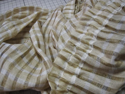
The biggest issue was lining.  The woven damask pattern completely washed out when sun came through the fabric.  To decide on the best lining option, we sewed together 20" of four different lining combinations.
To the right, one layer of napped sateen.  Next to that is natural interlining, then dim-out thermal lining, and all the way to the left, khaki napped sateen, all three of those layered between the face fabric and ivory sateen.
When the panel was hung, of course the linings are in the reverse order.  On the left, the single layer of napped sateen was very little help in preventing pattern wash-out.  To the far right, the khaki layer blocked a surprising amount of sun.  In the middle, the two other options were similar, except that the natural interlining enhanced the yellow in the ocher ground to produce a beautiful luminous gold color, and and also lent its rich fullness, which the dim-out could not match.   We agreed that natural interlining and ivory lining were the way to go.
For the mockup I wanted to actually sew the shaped goblet pleats, which as you can see I did not get around to tacking; that helped us determine a few other things- first, the 6" deep pleat is just a little too much, as the shadow line falls below the bottom of the window trim; and the more rigid buckram was the best of the 3 options we tested.
Up close we also decided we liked the gold silk for the microcord, but we'll make it a tad bigger so it will show up better.
Also I think that the cutout shape could be a little more exaggerated, so I'll modify my pattern for the real thing.   One thing I learned from this trial panel is that it would be much easier to welt the facing rather than the body of the drape.  To prevent distortion around the curves, I'll use a fusible fabric stabilizer on the facing.  I think I will not cut the shape in the panel until sewing the layers is completed.
Lastly, we both liked the panel puddled- neither of us being "puddle people," we were surprised! 

Friday, October 25, 2013

Fab Fabric Friday!- and box pleats

This Kilim-inspired Pierre Frey velvet on linen will soon be drapery panels in a home office with Venetian plaster walls in a deep rusty cinnabar.
This open box pleat style was the homeowner's choice after we mocked up several pleat options.  It is a great style for the irregular geometric pattern.
As soon as the fabric arrived, I evened off the edge and saved the strip to use as a template for trying out different pleats.  The centers of each motif area are marked with black Sharpie pen so I wouldn't lose track.
Under the panels will be Roman shades in the linen sheer, with leather lacing appliqued in a grid.

Wednesday, October 23, 2013

Wednesday Worktable

Mid-week is a good time to show projects that are in progress, nearly finished, or about to begin.  I think I'll make this a regular weekly feature, and I'm calling it "Wednesday Worktable."
Here is a peek at projects on the table right now:
I'm going to put the finishing touches on this full-size mockup panel today, while watching the WCAA Lunch and Learn Webinar.   This mockup with the client's actual face fabric has four different lining options and three buckram options.  We will hang it in the homeowner's window to see which lining combination best prevents pattern fade-out in direct sunlight.  This also will give us the chance to test and finalize other aspects of the design and fabrication.
These six shades went out for installation last week, but the homeowner requests longer bead chain loops.  I've ordered the new, longer loops, and will switch them out tomorrow.
Here's a shade project I won't show until it's all done, but this look at the materials will give you an idea how cool it is- sheer linen with leather lacing topstitched in a grid.  Can't wait to get these on the boards and strung!
We have two re-purposing projects in the house right now: this one is a very grand top-of-the-line bump-interlined velvet-banded hand-sewn chintz-lined drapery (whew!) that is being dismantled, re-imagined, and updated for a lighter look in a traditional dining room.
The other re-purposing project will turn these long rod pocket casement sheers into long Roman shades.  The fabric is in good condition and neither the decorator nor the homeowner really want to toss this warm plaid which works so well in the room. 
And finally, not literally on the table but next to it, fabrics just arrived yesterday for a whole-house project, phase one: 16 Roman shades, 125" long grommeted panels, and a few miscellaneous other treatments. 


Monday, October 21, 2013

Installation day!

I can't believe all of last week went by without a single post.  Things were really hopping.  Friday was the culmination of much of the week's work, with the installation of these wonderful window treatments.
The guest house main floor is all open, so all treatments are visible with no walls in between.
In the living room, four mock hobbled valances, which I learned to make from Ann Johnson's webinar, are perfect- vertically, the pattern flows naturally, and horizontally, marches around the room very impressively.

On the other side are soft cornices for the kitchen- I pulled out Donna Skufis's video to refresh my memory on how to fabricate this style.
And in between, a London valance as soon as you come in the front door, unifies everything.  I posted a workroom shot of this valance last week.  The pink geometric of the soft cornices is used on this valance as contrast pleat inserts and microcord.
You might remember previous posts about the mockups/samples I made in preparation for the mock hobbled valances and the soft cornices.  The mock hobbled sample was indispensable to understanding how to work with the pattern on the real thing.  
For the four valances, the ikat-look China Seas fabric was railroaded.  I was thrilled with how well the pattern lined up!  Four valances around the room was pretty impressive. 

The soft cornice mockup was equally invaluable.

I learned that I needed to reinforce the fabric with fusible stabilizer (from Rowley) to support the diagonal cuts that go directly into each internal corner, right down to the quick!  Scary!
I was able to get very neat corners.
Often, simple is awesome.
For a very tall window in a narrow space, this plain, tailored valance is 24" long.
The Greek key trim is all it needs.

Friday, October 11, 2013

Fab Fabric Friday!- Chinoiserie

Seriously, does it get any better than this?
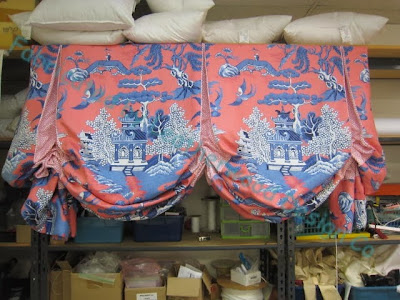
Ready to be installed next week, this Statement Treatment for an Important Window- high over a staircase, a deep London valance with just enough subtle contrast to make you take a second look.
Sometimes serendipity happens, and proportions, product, and materials come together in perfect harmony.  This fabric was split down the middle, joined with a contrast insert defined with microcord, and there was just enough selvedge to allow the pattern to meet perfectly at the splits.
Coming soon,  treatments out of the pink geometric print for the adjoining room.

Thursday, October 10, 2013

Venetian Bedroom, circa 1718

I love visiting the Metropolitan Museum in NYC, and since I became a member, it's great being able to just run in for an hour when I'm in the area.   No matter what I intend to see, however, I usually find myself migrating towards textiles.  Recently I enjoyed wandering through some period rooms and was especially impressed by this bedroom, a la Palazzo Sagredo, Venice, circa 1718.
The bed and its furnishings is a total show-stopper.  The green silk damask is everywhere in the room: walls, ceiling, windows, and door.
 
On the walls, a coordinating shaped border pattern is layered over the damask as a sort of mock valance, trimmed in gold.  But it was the skinny cartridge pleats on the portiere that really caught my eye.  I keep thinking about them, so I wouldn't be surprised if they turn up in something I make, sometime soon.
I peered in as close as I could to try to figure out where the fabric was seamed.  Oddly, the pattern wasn't even matched when the lengths were joined.  I've seen that non-match in other 18th century window furnishings as well.  
There are two windows in this room, and they're each treated differently.  The far window was pretty hard to see; there are very narrow panels and a shirred skirt under a carved header.
Due to the light glare the near window is hard to make out; an ondule shaped valance in two fabrics, trimmed  with braid and fringe, tops what seem to be functional panels. 
What can I say about the canopy?- over-the-top seems like an understatement.  The damask is pleated, draped, and swagged in weird, stiff shapes all around the myriad hovering carved figures.

Tuesday, October 8, 2013

Bay Window relaxed romans

Here is one way to deal with shades in a bay window.
The wider center shade has no returns, i.e. the fabric does not wrap around the sides of the board.
The smaller shades do have returns on both ends.  All the shades are on 1.5" boards, so at the inner edges the returns are 1.5".  On the outer edges, the return extends beyond the board 3" for a return of 4.5".  That's why there is a bit of a tail on the outer edges but not in the bay corners.
The larger shade snuggles up to the 1.5" returns which helps make the shades look continuous.
Just to be clear- there are no pleats, tucks, or folds in the shades; they are flat at the top.  That is the natural droop of the fabric.  

Friday, October 4, 2013

Mock Hobbled Valance

About a month ago I attended a webinar by Ann Johnson on fabricating mock hobbled valances.
I've made a bunch of these, but they were pretty simple, and I was winging it each time, and I wanted to see how Ann made hers.
The very next day after the webinar I took an order of seven, and since then I've received two more orders, for a total of 12 of these valances!
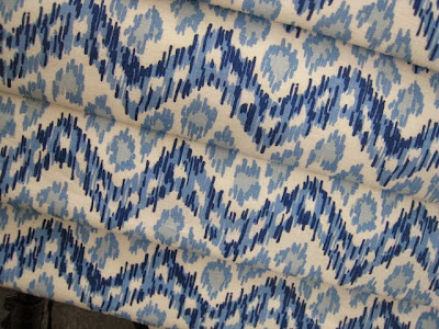
I needed to make a workroom sample to practice what I learned.  Since I've already made them with solid fabrics, I figured I should try my hand at the most complicated one I could think of, so I chose an ikat-look print.

The second and third folds do not match.
But the other folds match.

There are several ways of arranging the pattern in folds.  You can make every fold the same, or have each fold alternate motifs; or run it as it comes off the roll letting the fabric fall as it may; or, as I decided to do on my sample, the most complicated layout, make the pattern continuous from fold to fold, which means you pretty much need one repeat per fold, each one cut differently.

If you are looking carefully at the valance you have probably noticed that I goofed.  Even though I was trying with all my might, I cut incorrectly, and didn't have enough fabric left over to fix my mistake. (And that is why I like to make workroom samples.)

Anyhow, here is the first valance I made for a client.  There was very limited yardage, so I had to make it work with what I had.  The designer wanted 3 narrow folds with a flap at the bottom, and a deep fold at the top, to look sort of like a shade pulled up.   I was glad I'd done my sample to get some practice; the different size folds made this pretty complicated even though I wasn't aligning the pattern.

I did make a "cheat sheet."  After I marked my stapling lines on the board face, I laid out twill tape the way the fabric would be stapled, to be sure I measured right and also wouldn't forget the stapling sequence.

Thursday, October 3, 2013

Soft cornice!

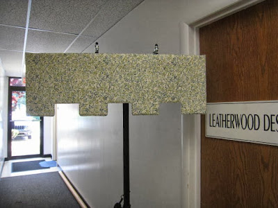
The client wanted valances with a cutout bottom shape that I thought could be best achieved with a soft cornice.  Though I've made soft cornices before, I was concerned about this particular shape- I was afraid the rectangles would curl.
I consulted the pros at the CHFA forum who gave me excellent advice, re-watched the soft cornice instructional DVD by Donna Skufis, and then got to work on a mockup.
I chose a good quality cotton similar in weave, weight, and texture to the one we'll be using for our client.   In the end, this turned out to be more than a mockup- it's a completed sample.
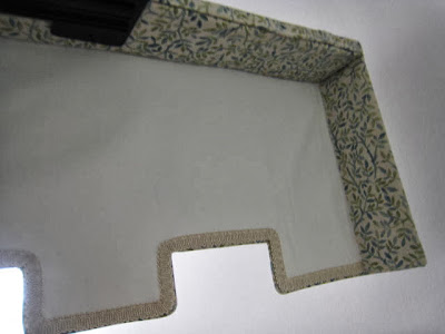
This valance has four layers: face fabric, interlining, Skirtex buckram, and blackout lining.  Microcord finishes the bottom edge.  The most important lesson I learned from my mockup: for the client's product, I will stabilize the fabric first, to be sure I can clip closely into the inner corners without the risk of fraying. 
My fears were unfounded- the rectangles left from the cutouts did not curl at all.  I was prepared to reinforce them with either cardboard, or wood slat fragments, or more skirtex, but they lay perfectly flat on their own.
The bottom edge on the back is finished with gimp.
I'm thrilled with how this came out!
I'll be starting on the real thing soon, using this pink and white print.